First off, thanks for featuring my work. It’s always a humbling honor anytime I get a spotlight. Second, thanks to Michael for hiring me! Alright, here goes:
After doing the illustration for Smoke and Stone, City of Sacrifice #1, I was again approached by Michael to do the sequel, Ash and Bone(s)(more on this S later). He asked if I had process shots that I could share, so I gathered a few screenshots from my somewhat chaotic process and put together a step-by-step sequence.
Unused sketches: I had this idea of using the dragon’s POV, as it was supposed to be one of the main points of interest. I thought they could work but they felt somewhat impersonal. Also, Akachi, the guy on the cover, is like my spirit animal (think nerd rage dude but made cool by Michael’s nightmarish imagination). So we went with a more traditional layout of the MC looking at the threat.
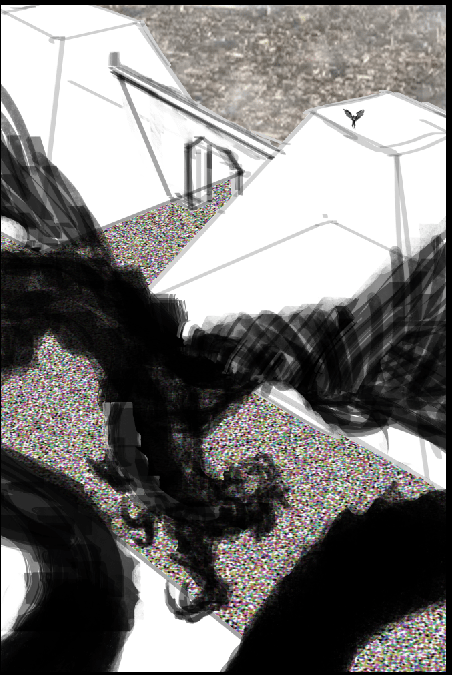
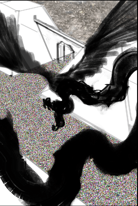
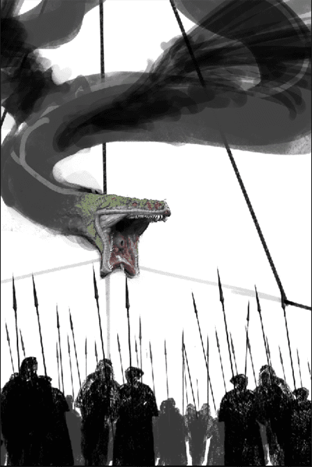
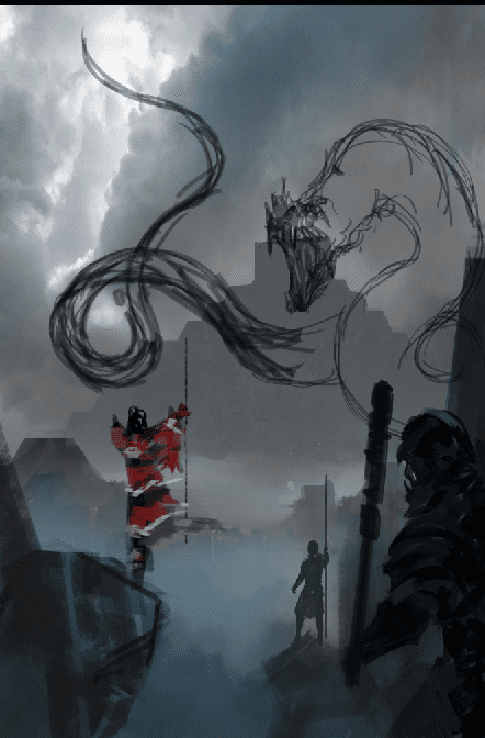
The original sketch is very vague, with no color and only some of the features (the dragon lacks wings, and there would be more soldiers and buildings).
Most artists, including me, do somewhat more finished sketches, sometimes with color. But this particular cover had many elements that I’m not super familiar with, so I kept them simple in order to develop as I go. Normally I wouldn’t recommend that. Ideally a sketch contains most of the main elements as they will be when finished. On to the steps.
Step 1: Started trying to establish a color palette, added the red sun, and additional details
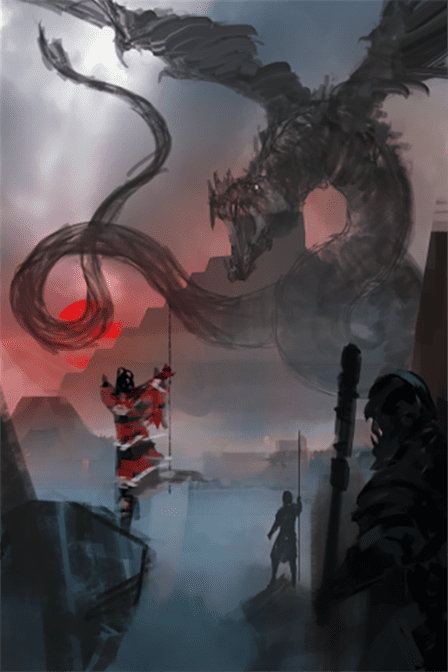
Step 2: More red, more soldiers!
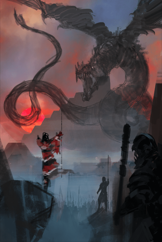
Step 3: Moved the sun as it was too close to MC, plus more soldiers(!). Also made the pyramid more alien/less Aztec.
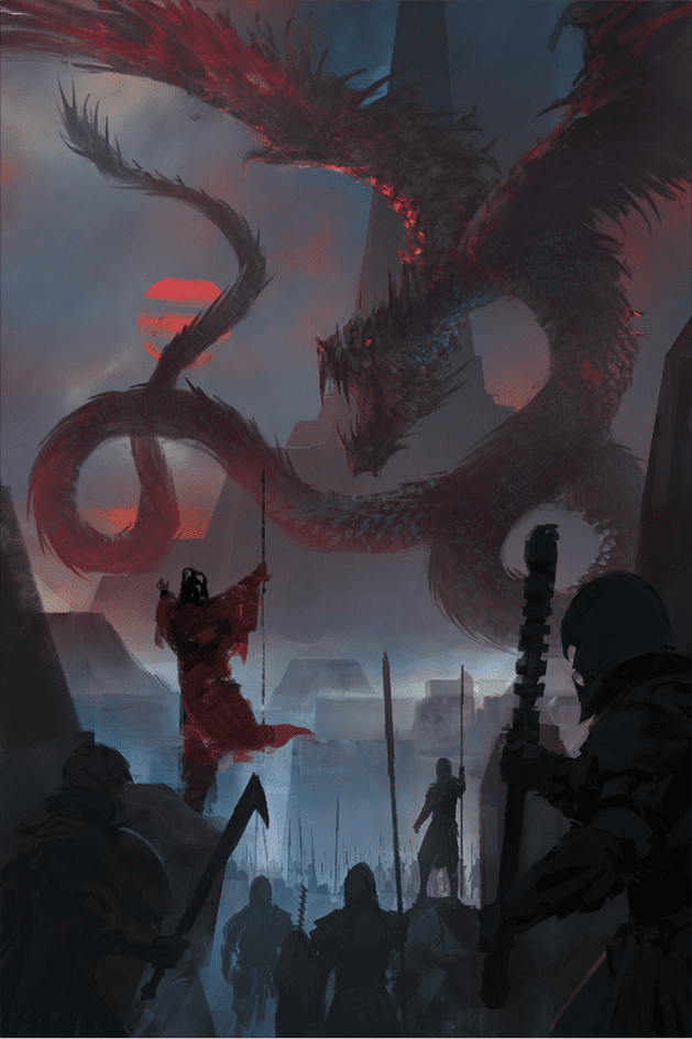
Step 4: This shit needs contrast! Plus, I want to see Akachi’s sexy chest and face.
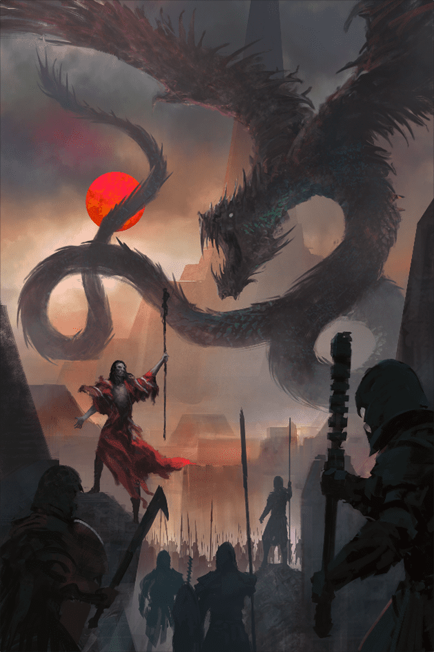
Step 5: To cloud or not to cloud… Also messing around with the color.
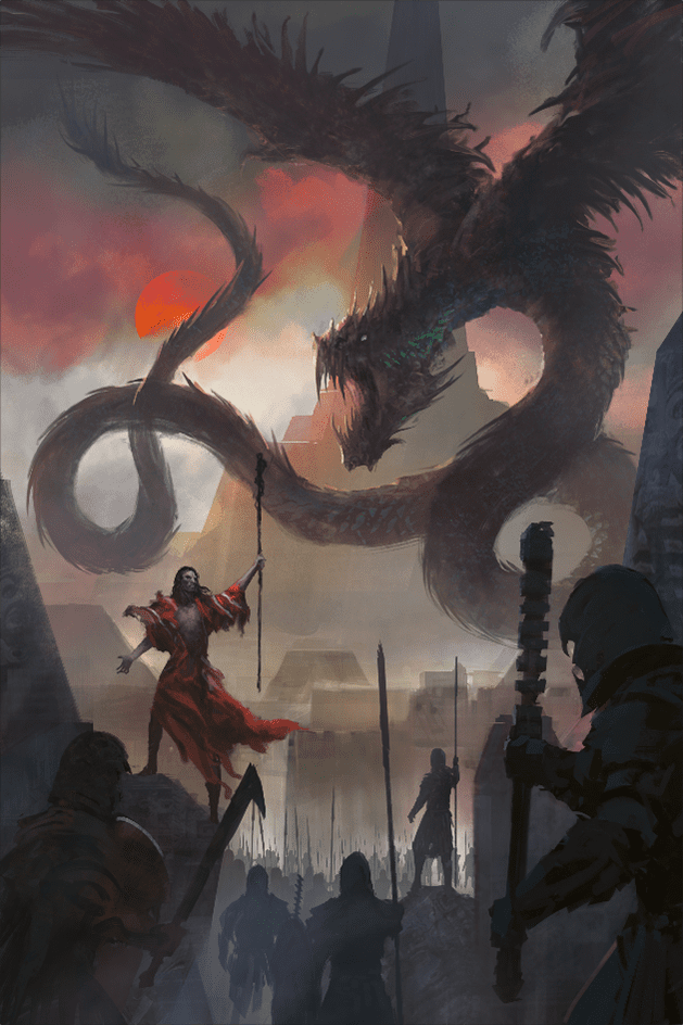
Step 6: More messing around with color and contrast.
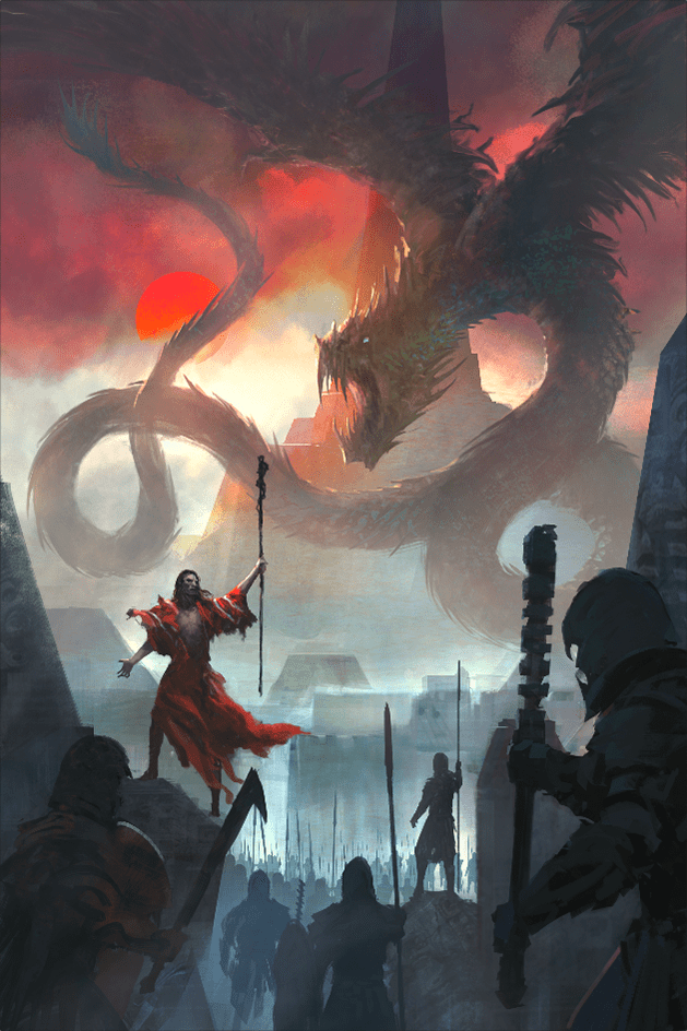
Step 7: I think it’s fairly common for most pieces to go through that awkward period where you think “what the hell am I doing?” but you keep plowing along because there’s no other choice.
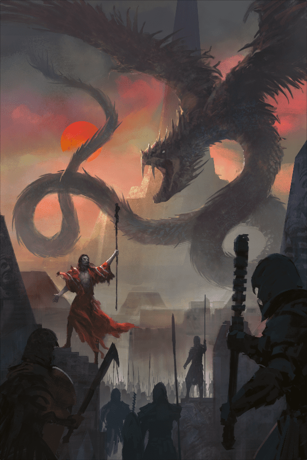
Step 8: At this point I show my wife and she says to drop a coil, so I do.
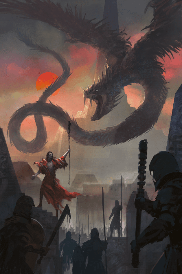
Step 9: Not THAT coil, the other one. Here I think I’m pretty much done, but Michael has other plans. He mentions he would like more detail on the snake and buildings, so I comply. for the buildings windows and some other details. For the snake mostly contrast, color and a little more dimension.
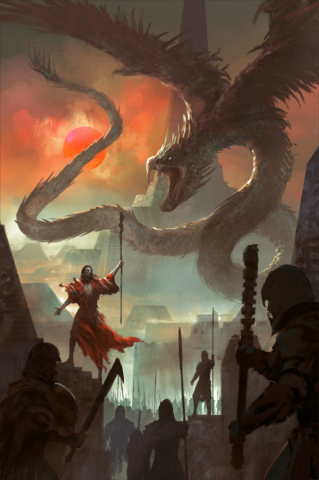
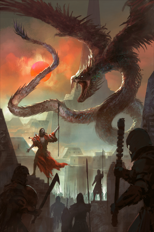
Step 10: During this whole process he mentions he wants to update the typography for the first book, and use the style for the second. So I offer my help, being a designer myself. Something I like about working with Michael is that he lets me experiment, so it was a reason I jumped at the opportunity. Now, I focus mostly on illustration since my background is mostly corporate design. Still, years of exposure to fantasy, and collaborating with all mighty design god Shawn King has taught me some cover skillz (I like to think). So I looked for suitable fonts for what I wanted to do: something fairly simple but interesting that would work with both covers, and interact with the illustrations.
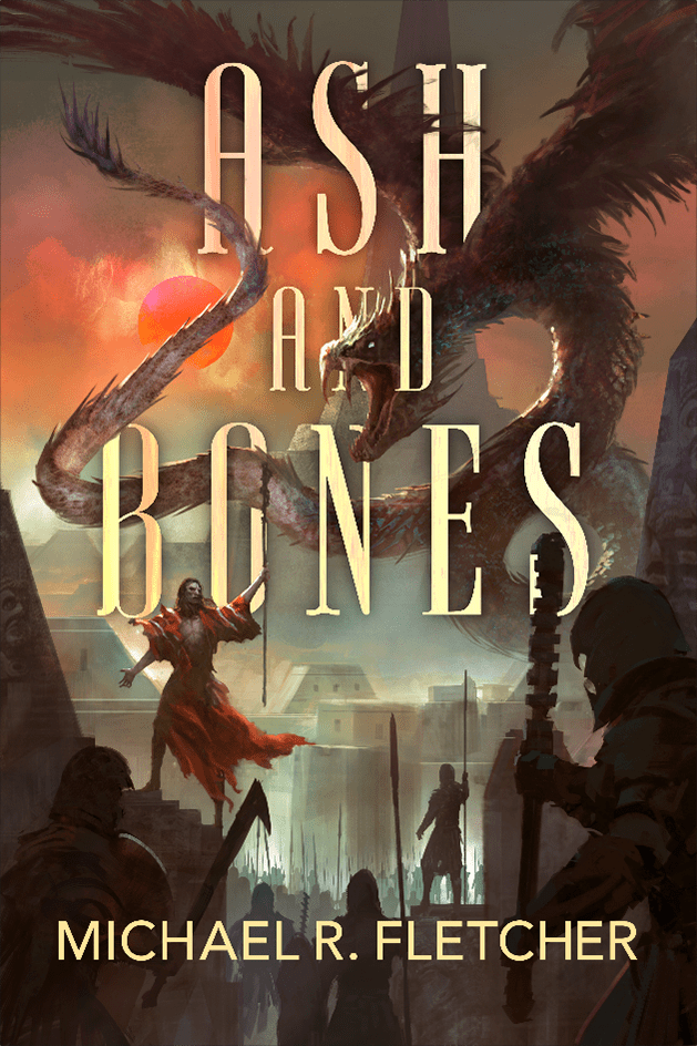
-About that S. Originally it was Ash and Bone, but my artist brain wrote Bones. When we realized it, I tried to fix it, but the alignment was wrong. The B looked like an R and the O like a C, as they were behind the character and dragon, so we kept the S to make it readable.
-Other notes: Art is hard, especially when you don’t work with an art director who can give direction. Sometimes I think a piece is (close to) done… until I get feedback. It’s always eye opening the amount of details I miss or have to change after so many hours looking at a piece. It’s great to work with authors (or fellow artists, friends, my wife, or anyone with an artistic eye) who can give good feedback. It’s a humbling exercise and SO very important for growth. Always keep an open mind!
Hope this helps someone somewhere!

If you want to check out more of Felix’s artwork, check out his ArtStation website @ https://felixortiz.artstation.com/
OR
Give him a follow over on Facebook @ https://www.facebook.com/felixortiz


Love this post! I love Felix’s work and this is stunning😁
Right?!?!?!?!? He is up there with Richard Anderson as one of my favs